![]()
Denise Callan, Momentum Educate and Innovate
When it comes to launching a new project, first impressions count. One of the first tasks of a project consortium is to establish a clear visual identity, one that represents the objectives of the project and can also create impact, particularly with our target audiences.
With an in-house design team and over 20 years of brand development, marketing and communications experience in the rural development and education sectors, Momentum is the co-lead of dissemination in smart4food. We are responsible for creating the branding, including the logo and branded templates for presentations and publications. We also led the sourcing of images that represented the project, its activities, and ambitions, and set the tone of voice of the brand.
Creating a logo
A well-designed logo with strong imagery can make a brand more memorable and recognisable to its audience. Importantly, it also helps to convey the brand’s personality and identify the project’s aim with our target groups.
The process began with a Momentum team brainstorming session with lead graphic designer Gillian and with the wider project team Denise, and Orla. Several concepts were explored, and finally, a short list of brand ideas was developed and presented to all the partners. The options were put to the Partners in an online vote, and the final logo was selected. Refining our tagline was a very important step also – how to distil a project into a handful of words. This is always an interesting phase of the project and helps partners understand their motivations – we speak about project values and what our target groups need and will resonate with.
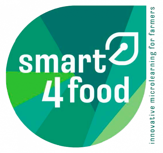
The logo for smart4food was developed with the core principles and objectives of the project in mind. The project strategically addresses the needs of family farms and smallholders. These are represented by using Green in the brand identity. The selection of various shades of Green, presented in different shapes reflects the diversity within this community, each small holding telling its own story.
Overlaying the project title in white is a strong highly visual statement and the leaf-like icon confirms our commitment to sustainability. Finally, the tagline clearly states our project purpose and target audience.
The brand has been used to develop a series of branded templates for use in PowerPoint presentations and in project publications. The brand will also anchor our website, social media and Newsletter communications, creating awareness, recognition and trust for the project with its target audiences.